Python library Matplotlib
Matplotlib is a plotting library in Python. In this section we give a brief introduction to the matplotlib.pyplot module, which provides a plotting system similar to that of MATLAB. This is basically a library for 2-dimensional plotting with Python.
Matplotlib comes with a wide variety of graphical plots such as line plot, bar plot, histogram, scatter plot etc. Graphical plots helps us to understand trends, patterns, and to make correlations. They are really useful for getting quantitative information. Some of the sample plots are covered here.
1. Line Plot
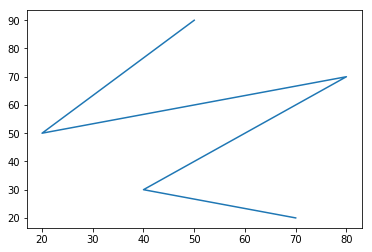
The most important function in matplotlib is plot(), which allows us to plot 2D data using line plotting. See the example below:
import matplotlib.pyplot as plt
# X-axes values
x = [50, 20, 80, 40, 70]

# Y-axes values
y = [90, 50, 70, 30, 20]

# Function to plot
plt.plot(x,y)

# Function to show the plot
plt.show()
Output:
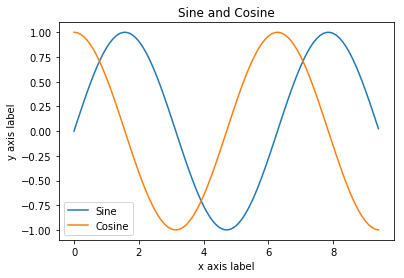
We can also plot multiple lines at once, and add a title, legend, and axis labels. See such an example of line plot below.
import numpy as np
import matplotlib.pyplot as plt

# Compute the x and y coordinates for points on a sine curve
x = np.arange(0, 3 * np.pi, 0.1)
y_sin = np.sin(x)
y_cos = np.cos(x)

# Plot the points using matplotlib
plt.plot(x, y_sin)
plt.plot(x, y_cos)
plt.xlabel('x axes label')
plt.ylabel('y axes label')
plt.title('Sine and Cosine')
plt.legend(['Sine', 'Cosine'])
plt.show() # We must call plt.show() to make graphics appear
Output:
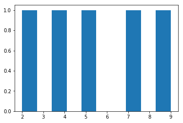
2. Bar Plot
We can create bar plot with pyplot.bar(). See the example below:
import matplotlib.pyplot as plt

# X-axes values
x = [6, 3, 9, 5, 7]

# Y-axes values
y = [10, 5, 8, 4, 2]

# Function to bar
plt.bar(x, y)

# Function to show the plot
plt.show()
Output:
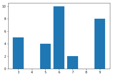
3. Histogram Plot
We can create histogram plot with pyplot.hist(). See the example below:
import matplotlib.pyplot as plt

# Y-axes values
y = [9, 5, 7, 4, 2]

# Function to bar
plt.hist(y)

# Function to show the plot
plt.show()
Output:
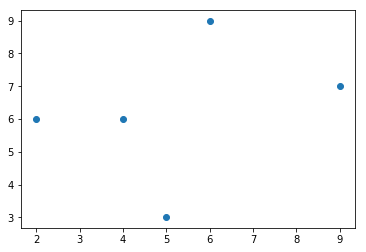
4. Scatter Plot
We can create scatter plot with pyplot.scatter(). See the example below:
from matplotlib import pyplot as plt

# X-axes values
x = [6, 2, 9, 4, 5]

# Y-axes values
y = [9, 6, 7, 6, 3]

# Function to plot scatter
plt.scatter(x, y)

# Function to show the plot
plt.show()
Output: